


These badges are all scanned at the same size. On my screen the round badges/buttons show up as just under 5cm (2 inches) across while in reality they are just over 5cm across. If your display shows them larger than this, try standing a few feet away from your monitor to get the right impression.
| Here's a pretty good badge. The name of the convention ("Attitude") and nothing else. Even the name is curved to give more space for the name. However, it's a bit plain and would be easy to fake. A lot of cons like to have the membership number visible in case of disputed identity. This was a small con so that wasn't an issue here. | |
| Not a very good badge. Not only does the illustration dominate the badge (all that heavy black in the centre just draws the eye), it even spills onto the tiny space reserved for the name. Use of a bold sans-serif font means you can probably read the name from a couple of feet away, but think what this would look like with a long, double-barrelled name in the same space. | |
| Poor. The convention name ("Intuition") is sensibly curved up, leaving quite a lot of white space for the name. They just haven't used it. | |
| I don't even remember what this badge was for. All I know is that the name is almost completely unreadable. It's minute, in a script font, forget it. | |
| No, I wasn't a walk-in. All the badges were like this. Even in 1988 people should have known better. A name badge isn't really the place for cute illustrations and commemorative information. | |
| Great badge! | |
| This is a badge I designed for the 2001 Smofcon in York. It's very plain (more so than I wanted) but it tells you the name of the con, when and where it is, and you could read the names from the back of the room. If anyone's interested, I still have 20 or so reject designs from this exercise, any of which would make a good starting point for a badge. | |
| 2Kon were the first Eastercon to use laminated badges. So why, given all that space, did they waste it on their logo and put the person's name in such small type? Could it be they just had a cool logo and wanted an opportunity to use it? | |
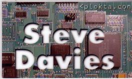
| This was the badge we designed for <plokta.con> in May 2000. If you look closely at the badge, you'll find the name of the con, the dates, the hotel and the city are all apparently etched into the circuit board. And this badge you can read from halfway down a corridor. | |
So, there we go, 9 different badges, what have we learned?